Future of Sales Letters
The other day over on the Virtual Mastermind forum we had a lively conversation about the future of sales letters.
Some members are really excited about “pretty new infographic style” salesletters.
They think they “look better”, and in their minds, that means
they will work better too.
But history is not on their side.
Time and time and time again, ugly beats pretty.
And long beats short.
I don’t why it is…but it is.
But no matter what you put out as your sales letter, you can’t know for certain what will work until you test it.
All the serious business owners test.
That’s one thing that separates the pro’s from the amateurs, the guys making bank from the people that struggle.
What works always “depends”.
It depends on the age and background of the audience.
But no matter what your audience, never underestimate the power of a good story told in simple black and white lettering like what you see working for the REAL big players in info marketing (i.e. Agora Financial, Stansberry, Boardroom, etc.).
For younger folks, yes, you might get infographics to work, but older folks, like me, the ones that actually have money to spend, often prefer to read black text on white background.
Why?
Because that is what they know, like, and trust.
Would an infographic version do better to older adults?
I don’t know, but I highly doubt it.
What I do know is that my new salesletter for HomeWorkoutRevolution.com is working really well for me.
It’s not an ugly sales letter, but most important, it has great copy, perhaps the best copy
I’ve ever written.
There’s a lot to learn from it.
The headline contains specifics (one of the biggest lessons that Yanik Silver instilled into me from his coaching).
And it touches on all aspects of the prospect’s desires.
The layout is “sales page 2.0” – cleaner, mass-market friendlier, and arranged in a way that is better than most traditional sales letters.
But you know what else works?
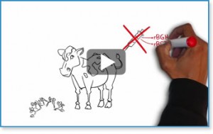
The sales videos at Biotrust.
Why? Because of pictures of cows?
No, because of great copy.
It’s the WORDS that matter most…not the artwork.
Check out their sales approach here:
Maybe we all just need COWS in our videos?
But wait, there’s more to consider…
Here’s another UGLY text sales letter that is selling thousands of books each week:
Maybe we just need:
a) to put on more oil and be shinier?
b) to have a two-step written sales letter?
As you can see, many approaches work.
So what is best for you?
First, you have to know your market demographics. Then decide whether you want to follow the crowd (sticking to industry norms) or try something completely different.
But in ALL cases you must TEST.
Because…
“In God we trust, all others require data”.
Opinions are useless without data to back them up.
Only test results light the path.
And at the end of the day, even all of these different methods are just tricks.
Because…
Nothing beats a big idea.
A BIG IDEA delivered in black and white text will beat a mediocre idea delivered in a hand-drawn, talking cow video with oiled up shiny folks in some type of bizarre infographic.
Because the BIG IDEA is what really, really, really, really matters.
“Nothing can stop an idea whose time has come.” – Victor Hugo
Not even an oiled up cow,
Craig Ballantyne
Action leads to the attraction of more & more great opportunities that will fall into place in your life. Keep on pushing

